
However the bad thing about this picture is, that the viewers eyes guide along the banister but the banister stops half way; so as soon as the banister reaches half way your eyes suddenly start to look at the whole picture rather than focus on the S Curve.
This picture is quite dull.
I like that the banister guides the eyes at the start of the picture and that the light hits directly off the banister. On the other hand, I dislike that the picture has a slight shake on it . Also that the banister stops half way so the eyes are cone tested on the whole picture and that the triangle at the top also takes the focuss off the S Curve shape. I would change this by using a tripod and a higher shutter speed (no lower than 1/60). However, the triangles keep the eyes inside the picture. This picture lacks of vibrant colours but because the colours are so dark, the reflection of the light along the banister is more affect which attracts the eye to the point.
The feeling of this image is quite morbid and isolated because of the colour and the angle at which the picture is taken at which consequently means that the perspective of this image is kept in the image.
The picture reminds me of an old dungeon stair case because the stars look very steap just like an old Victorian stair case.

The way that this picture was taken was free hand without using the tripod. Without using a tripod, the photographer had the risk of camera shake. However, by moving the shutter speed at 1/60 second, would get rid of a camera shake.
The work which I've taken have been around college, so my theme for this project is college based. So, I maintain continuity - to a certain extent, of various pictures around college but none of them have the same subject.
The image here guides the viewers eye by the contrast between black and white. However, this could improve if I captured more triangles within the picture because they keep the eye in the picture.
I like this image because it is very abstract compared to the others. I like the contrast between the colours and the meanings you could imply from it. However, I dislike that after looking at the White block the eye drifts out of the picture because there's nothing more keeping it drawn in.
The context of the image connotes two opposed feelings as I said before. I think that even though there's more white in the picture, this picture is also quite sad and dark. I think this because the black block can demonstrate that after life there will always be death, which I think is very dull.
Depth of field isn't used in this image because I didn't think it was necessary to be used as I'm not defining a certain object or subject.
To describe this picture I would say that it is darkening and shows foreshadowing events if you relate it to life.

In this picture you can say it's showing a form of escape. Which it is, but if you look at it closely, it doesn't entirely mean it's a bad thing. For instance the white light at the bottom of the stairs shows that it's a way out and that way out can mean there's a good thing at the end of it. This could link to the tone picture's meaning, showing that there's a life. However, this picture reminds me of some sort of escape because of the staircase. You see, this kind of shot in films or tv programmes, usually to connote that there's something there.
The colours aren't dark at all so it hasn't got a dark meaning to it.
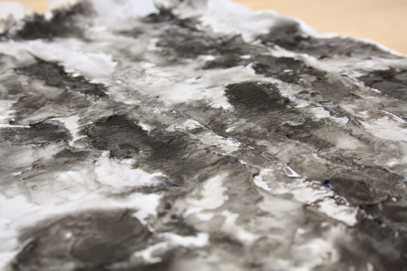
The viewer can see that the picture is rough and quite busy because there's a mixture of black and white everywhere unlike block colours like my tone picture.
From the picture I enjoy the middle of the picture how the texture draws your eyes in. However, once your eyes look at the texture they start drifting all over the picture rather than a main focus. If the photographer placed more triangles within the centre of the picture, it would've kept the eyes focussing in the centre. This image connotes dark feelings because as you can see the black is on top of the White which implies that the black is more superior than the White. This suggests that the dark feelings are over ruling happy feeling or memories because black symbolises death and ending whereas white symbolises start of life and new beginning. Maybe that the White could depic happy memories however, the bad memories are over taking the good. I do the the colours here move your feelings because of the mixture of colours, the colour scheme in this picture are quite dull so immediately it sets off a dark and nasty tone towards it. The picture here reminds me of clouds because you can get clear clouds which imply a lovely day or you could get clouds which are grey and dull which also imply that it's going to rain. Plus, if bad clouds are out they always over lap a white cloud- just like the painting is doing here.
The depth of field in this image is used in the centre of the picture because that's where most of the texture was seen when the sunlight shone upon it, so it blurs out the rest of the image. This is effective because it keeps the eyes within the picture.

This photo is very leading. The thing which I enjoy within this picture is the angle which you can view the pattern at because your eyes follow the pattern. However I could improve this photo if I made the wall for distorted and focussed the main feature on the pattern.
This picture reminds a dado rail because the leading lines and the continuous pattern make is seem as a boarder. A boarder is to grab someone's attention and because the pattern on the picture it grabs someone's attention.
 Shape- This image guides the viewers eye by involving several triangles and of course, triangles keep the eye inside the picture. There are several big triangles and within them there are smaller triangles. This is affective because the viewers eyes are immediately drawn towards the big triangle that takes up most of the image. The photographer here has framed the image affectively because it's a busy picture.
.
 Colour- In this image there are various of different colour which contrast when they're against each other. Such as the yellow contrasts against the red or the green contrasting against the dark blue. The viewers eye gathers towards the middle because majority of the pens are gathered there, also that's where majority of the colours are side by side to each other so they're all contrasting.
.
This image to me connotes that the pens symbolise people and the fact that the pens are different colours show that people are different in their own way but we all go together. For instance, the pens are different because of their colours but they have the same purpose which is to write. Just like people are all different, but our equality is all the same.
 Form- This image here shows different angles because of the way the bottle is facing, so it automatically leads the eyes into looking diagonally. Within, this image it uses quite warm colours such as purples,pinks, reds, etc. This immediately warms the eyes and makes them feel quite relaxed.
No comments:
Post a Comment