HAZARD REDUCE RISK LEVEL OF RISK
Falling down stairs- could Watch the steps and where you're Low
be doing standing or posing
the shoot on the stairs
Camera dropping- camera Watch how you're holding it, make Medium
could fall and break then you sure you wear the strap around
won't be able to shoot your neck
Monday, 15 December 2014
Planing For Personal Project (Location)
The location where I'm planning to shoot is at my house because Sherman used a house based setting within her film stills.


 Here these film stills are based around the locations within a house. These photos inspire me to shoot my project within a house scenery. Just like these I'll take photos in the bathroom, living room and other various rooms around my house. The furniture, however, needs to be quite old fashioned looking and not modern.
Whereas the picture below is shot outside and many of her film stills had the Marylyn Monroe's inspired "outside look." I think I'll try some shots outside, however for me to create this look I think would take hard work because of the people walking past you, the lighting, etc.
Here these film stills are based around the locations within a house. These photos inspire me to shoot my project within a house scenery. Just like these I'll take photos in the bathroom, living room and other various rooms around my house. The furniture, however, needs to be quite old fashioned looking and not modern.Whereas the picture below is shot outside and many of her film stills had the Marylyn Monroe's inspired "outside look." I think I'll try some shots outside, however for me to create this look I think would take hard work because of the people walking past you, the lighting, etc.
Friday, 5 December 2014
Planning For Personal Project (Appearance)

 Within the 40's and 50's era, big curls were the fashion statement. Cindy Sherman uses the idea of a curly, big hairstyle. In my photography I'm going to style my sisters hair similar to this kind of hair style. The main look which is used within these two images are 'pin-ups' which are curly hair thats had a section of it pinned up. However, because my sisters hair is too long for the curls to stay, I'm going to have to use extra products and turn the temperature on my curlers on her hair (maybe holding the hair onto the curlers for longer may work?)
The hairspray I'm going to use is L'oreal long lasting spray. This is to ensure the hair stays in place for a long time. Also within form the 40s- 50s research has informed me that hairspray was massively used to keep the hair in place and looking defined.

To section the hair I must use a tail comb, this is so the section of the hair is accurate and theres a straight line. Also it;s to make sure that each section of hair is equal. Whereas the comb part is used to brush out the curls. This is so the curls look quite bushy rather than tight, thin curls.
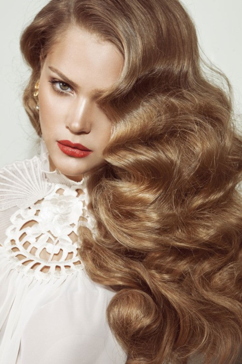
 I want the hair to look like this rather than the bottom picture. As you can see, the hair has a constant wave on it which allows the texture in the photograph. The second picture is more modern curls, where the curls haven't been brushed out.
However, because the heat off the curling iron burns my hair, I protect it with Loreal Elnett Satin protector to ensure a smooth finished feel, without dead hair.


As you can see, the face chart below is from a 50's inspired look. This is the kind of look I wish to create. I have also placed two tutorials for the eye and lip make up. On the eye it uses quite a nude eye shadow lighter than the actual skin tone and on the lip of the eye theres a more bronzier shadow. This is to create a shadow, in the 50's women used to adore this look- it really brought out the eyeliner lining the eye! You notice that the tutorial uses a fine brush, probably a 0.2 paint brush to define the eyeliner across the eye. This is to receive a defined line.
Also the beauty spot above the lip or below the eye was a main essential in the 50's.
Planning for Personal Project (Research)


Marilyn Monroe
Cindy Sherman took inspiration from this specific pose from a film still which Marilyn Monroe was in. I think the reason why Cindy chose this image was because it's very feminine and every males dream woman. However, because of her position and facial features it suggests that again woman were seemed as an object rather than a human being. So, personally I think Cindy tried to show how woman were objectified without anyone noticing.


Here, Cindy remade the shots again inspired by Marilyn. Here it shows Monroe posing for pictures in New York (a busy city). It shows here beauty and how she's casually walking through New York as if she's an ordinary person. I think Cindy here was inspired by how casual she is but because back in the 40's woman stars were more about appearance rather than their talent. I believe Sherman is trying to suggest that the appearance of a woman over powers her talent and role.


Cindy Sherman
Within this shot Sherman was inspired by Sophia Loren's famous shower shots. I can tell she was influenced by Sophia because Marilyn tends to look away from the camera whereas Sophia looks directly at it because she's known to be an independent, strong, female character which was quite rare to see back then.
Within these two bottom images she was mostly influenced by Marilyn. I can tell this by the hair style and make up used. Especially the coloured picture. The way she's sat leaning her body forward was exactly how Marilyn was known- her lean forward. She's trying to show that women use their bodies to get attention rather than there voices.


Sophia Loren
Unlike Monroe, Sophia Loren is very independent, strong minded and controls her attention by the looks she gives. I think Loren's green eyes did the bright work for as, she knew how powerful her eyes were within the media and took advantage by staring into the camera. This look makes the viewer draw into the image and makes you feel apart of it. The feeling of these images is that she's very superior within the female category of actresses.
However here, ben though she's looking away, the stance of her body is very straight and prominent as if she's in charge. Also here arms and legs are very tight towards her body, this conveys that she is in charge of who speaks to her and doesn't allow anyone in.


So, within my photography I'm going to use the role of a strong 40's/50's woman in the style of these idols.
Sunday, 30 November 2014
Martin Parr Research

Here is a photo from which a famous photographer had taken called Martin Parr. From my research I found out he photographs photos which are to do with modern society and how it's implied within a photo, for instance this photo is probably a mother and daughter although it may seem like quality time spent together the meaning here is that young children (in particular young girls) are growing up too fast.
The exposure within this picture is a little under exposed slightly. I think the photograph did this to imply that the time spent together isn't the bad thing, however the dark side is the young girl trying to be older and wearing make up.
The focus here is immediately on the elbow which is quite sharp. As the elbow bends, it guides our eyes towards the finger which has a soft focus. I believe here the photographer purposely did this because the finger in the picture is the main focus and it's the direction which the girl is looking at. The girls face is also quite sharp on the picture. I think the focus is used appropriately here because it presents the make up in white a harsh light, whereas on the woman, her face is slightly softer because society again "believe" it's acceptable for a woman to wear make up.
Theres no rule of third in this shot because it focuses on the two people on the picture rather than the scenery. However, the picture is mainly white walls and slightly the angle of the couch. The cleaniness of the walls, couch and pillow implies the child's behaviour is very adult like because theres no mess made and again connotes that she acts as if she's older than what she is.
The light on the girl is quite harsh whereas on the woman its soft. This is because the first thing the photographer wants you to notice is the little girl, especially her face. On the other hand, her 'mother's' face is quite soft up to her lips. The facial expression, mainly her lips allows the girl to let her put make up on her which some may say this is wrong because children are stereotyped to play with dolls, however the photographer is i think is trying to suggest that, you give a little girl a doll and they'll play with their her and face, so what difference does it make if she does the exact same thing on a doll to a human? How does it make it anymore right? He's trying to suggest that its ironic that society believe girls should play with dolls but think its wrong when they do the same on themselves or others.
The death of field here is quite shallow because you can see the detail on the pillow again its to show the tidiness of the house. I think the depth of field works within this picture because it shows the meaning of the picture very well.
I think the way the photographer has cropped the photo is very smartly done because he's cropped it quite tightly but still includes the main pain of the pictures. I do think if maybe he added the picture at the top left hand corner it could connote something again. Despite the photo being cut out, it's still sends the same message so really the photo at the top isn't necessary within the picture.
The colours within this picture are rather plain which I do like, whereas on the face the colours contrast against each other. On the face it uses turquoise eyeshadow with bright red lipstick. The reason why the colours on their faces are like this is to show that its not natural looking and its very fake, just like the situation being quite strange or surreal in a sense.
Here, Parr uses a slight curve on the finger. The effect here is to guide our eyes directly towards the eyelid where the eye shadow is placed. The reason why the photographer did this is so we recognise the make up and think the meaning of this picture is more profound; that we (adults) affect how young children act, look and present themselves.
Within this image Martin Parr uses leading lines on the arms. I think here the photographer purposely did this so us as an audience notice her posture, that she's quite laid back on the couch. This suggests that she's allowing the little girl to put make up on her and that as a society were allowing young children to act older. The fact is that were not seeing the problem in front of us, were allowing children to become adults too quick. Also that this idea of "child hood" doesn't exist anymore, because shouldn't it be the adult taking care of the child not vice versa?
The light areas are mainly used on their faces, especially the girl's to emphasise her concentrating on the woman. However, Parr uses ring flash to create the light on the face. On the other hand, theres not really many dark areas in the photograph, which shows that every part and object of the picture tells us something. We recognise or see the image as a safe environment but the photographer has an ironic meaning to it because such dangerous changes are being made within a safe environment.
I think the photo is balanced because as an adult you're seen as the 'bigger' person, so less objects are biased on her side whereas on the child's side more objects are there. This is so our eyes don't only focus on one of them at once, it brings our eyes within the middle and again leads us to the finger where most meaning is coming from.
I definitely think the picture opens my eyes towards society especially because like the woman we have our eyes completely shut to this problem and act as if it isn't going on. Even though the mood of this photo is a 'lovely' image, it contradicts it's self because the meaning of the image sets it as a quite sad mood. Unlike his other photos, it doesn't suddenly show a bad side on a mother and daughter, however it does have a profound message once you look at it properly. I do think the photographer intended to set the mood, to make us as a society realise this problem. Personally, it makes me feel quite relieved that someone has raised this problem because I do think society are looking past it.
I do think the photographer succeeded in telling his message within this photo because the make up used here is bold and tells a story its self.
I do like this photo because of the message which it portrays. Also the colours used, the basic white blouses shows that the young girl is quite older and mature and the coloured pillow in the background is quite colourful, it's as if she's left her childhood behind her and already became a woman.

This picture is again from the photographer Martin Parr from 2008, taken in Britain. Within this image it shows the upperclass celebrating a particular event (probably a wedding or a certain sport.)
The exposure in this photo is the right exposure. I think this happened because he didn't need a flash or a back light, as he's outside so natural sunlight was enough.
The only point in this photo thats in focus is the higher class man and the champagne glass whereas the whole background has a soft focus. I do think the focus is appropriate for this picture because its mainly focussing on one man. The effect of this is to show society that one man alone has wealth so imagine a group of people, yet they all sit round the table in their own luxury instead of helping the 'poor.' On the right side of him theres quite a sharp focus, however on his left side theres a soft focus. I think the photographer purposely did this to make our eyes look at the phone on his face. It's ironic because even if this man is particularly wealthy, he's holding quite an antique phone. So, he's quite ironic here with the phone. However, the way in which the man is holding the phone is as if she can afford it so he doesn't care. It's like the man is balancing the phone but judging by his facial expression he doesn't really care because he has money.
This image uses depth of field but Parr uses quite a shallow death of field to notice the man first but then slowly recognise the people in the background. I think the depth of field in this show works quite well because even though you see the man you also notice groups of them. This suggests that this photograph doesn't only regard on person, it requires a whole situation of people. Again it's ironic because even though the man hasn't got a great phone, you notice the cigar which he's smoking in his other hand and a cigar is an old symbol for people to recognise money, business and wealth. Also the champagne glass is in focus, again the champagne glass is for the viewer to notice that money is the main thing here. However, even if working class people don't drink champagne or smoke cigars, they do have the same phones, so it connotes to the upper class especially that were all as equal as each other no matter what luxury we can afford or not.
The light here is quite soft because it is outdoors and its quite natural light to give the rich glow about the scenery but the colour over all of the whole photo is slightly yellowish so the gold from the dress and champagne stands out more. I think the photographer again did this because the connotations of gold is rich and powerful- the most richest thing you could ever buy.
The photo doesn't use rule of thirds, however it does centres the pink hat. The reason why i think the photographer is because working class see big hats as a wealthy statement because realistically they aren't affordable. Everyone at the event are wearing hats again this suggests they are quite well presented.
I enjoy the business of the background because it shows a lot is going on even though they're all sat down. Also everyone in the picture have an up right posture, this suggests that they've been educated or brought up very well because the posture of their back is very straight. Obviously this photo contains all three: fore, middle and back grounds. The fore is obviously the man which you first notice, the middle is the woman with the big, pink hat and the background is the woman dressed in gold. They way that each person is positioned in a diagonal so your eye automatically looks at each stage in the photo. I think the photographer purposely positioned them in that order because the further you go down, the lower the money.
I don't think theres wasted empty space in this image, I think this image in general is quite busy. So, I believe the cropping here is accurate.
There are different range of colours used such as pink, gold, purple, cream (quite rich colours). The photographer here hasn't used many primary colours because it implies that the colours are very rich and for them to use very plain, complimentary colours because they were again well educated. The colours here connote elegance and superior.
In this image there aren't any S Curves which specifically stand out. However, there is a curve on the table where the man is sat. I don't think the photographer particularly did this on purpose because a curve makes did image feel soft, I think he purposely didn't allow any S Curves within the image to make upper class people seem more harsh, as if they're told how to sit, act, etc.
Thursday, 27 November 2014
Cindy Sherman Research

The photographer Cindy Sherman
took this image in 1981. Within this shot I think Sherman focused on how a
woman feels and emotions judging on the facial expression and the note she's
got in her hand. From this picture you can imply that it's a suicide or as if
something traumatic has happened. The exposure here I think is a little under
exposed with an artificial life coming from the top left corner. I think she
purposely did this so you can deliberately see her facial expression. Judging
from her expression, she's deep in thought about something, probably something
on the note. She almost looks 'dead like' because of the position of her body,
which implies towards the viewer that a horrible occurrence has happened.
The focus her is very
sharp. I think she did this again to draw the eyes especially at her body
because again her body isn't positioned as if she's placed herself in that
certain positions, it's as if she's fell or dead.
There’s no depth of field
used within this image, I think this was to show that there’s no specific
object that’s important, that the whole image itself is important.
The lighting here is quite
harsh, there are quite a lot of yellow and orange, I think this is ironic
because yellow and orange connote happiness and life, whereas this picture
suggests sadness and 'the end' of life to a certain extent.
I dislike where the note
is, I think the note should be more centered rather than on her side because it
depicts more emotion and dramatizes the image. However, you could argue that
the note being on her side could show the way she's fell and its quite a
distance away from her face, which suggests she doesn't want to re-read it,
that explains why its so scrunched up rather than nicely folded. Also the grip
on paper is quite loose.
I also dislike the cropping
in this image, I think it's been cropped too tight, it show the position of the
leg and arm because if the leg is straight it suggests towards the audience
that she's placed herself in that position whereas if the leg is dramatically
bent you can tell that she's not purposely been put in that position so
immediately you 'd think she's fell. Personally, I believe the leg is an
important part of the image.
The colours that are mainly
used in this image are orange. Orange usually symbolizes happiness, however
here Cindy is showing weakness and lack of independence which isn't only ironic
but is she's also contradicting her beliefs about women being powerful and
strong because her she shoes weakness on a piece of paper. This indicates that
the paper is more superior to her because she's showing how a note is
controlling her feelings. Maybe this is a way of telling girls to be more dependent
not themselves rather than their feelings? Also Sherman is wearing red nail varnish,
which connotes that something dangerous has happened or is going to happen,
that the note in her opposite hand is dangerous.
Her whole body posture is
on a diagonal, which keeps our eyes viewing her body up and down, rather than
the background behind her.
There’s also no leading
lines used to guide our eyes. I think within this image there’s no need to have
leading lines because the posture of the body already draws our eyes.
The photo is quite bright
near the top half of her body and gradually gets darker as it gets closer to
the note. This shows that the note brings sadness and darkness and the reason
that the shadow is starting to cover most of her body, like her emotions the
note is taking over her.
The mood of this photo in
general is quite frightening and sad because of the young women lay on the
floor upset and knowing Sherman is a feminist, so it shows a feminist being
over powered with just a basic day to day object. I do think the photographer
intended on this overpowering mood. I don't think she particularly succeeded
telling her story behind the image to a younger audience, however generally I
think she did because it wouldn't be the richest photography that’s on the
market. I like the image to a certain extent because of her facial expression
and the positioning she's in because it suggests a lot of things. However, the
image is quite confusing especially to someone who has never seen or heard
about the work she does.

Friday, 21 November 2014
Exposure Practice


Diagram of Camera
 Here I have drawn diagrams of a Cannon ( the camera which I use to take my pictures on) and labeled each part of the diagram.
ISO Practice


Depth of Field Practice

Here is a practice of depth of field which I did. This is my first attempt so as you can see it isn't as accurate as could be because you can still see the people in the background, the focus isn't on on certain pen and the viewers eyes will look all over this picture rather than just focussing on one main onject.


Raw Image Practice


 Here I have done a raw image practice. The top photo is of the college building which I chose to distort. On my left is the different scales which I have distorted my raw imagine files. On the bottom is the end result to what I distorted it to. As you can see there's a slight tilt.The affect I'm trying to get here is the illusion that the bulding is longer and slightly on a bend.
Subscribe to:
Posts (Atom)